Introducing Shieldbreak Archive
Welcome
Since before I even started building this site, while it was still just an idea in my head, I’d been excited to start developing the website’s brand. I knew I had to get something bare-bones up first though, or else I would just end up stuck in the planning phase until I got bored or forgot about it. So I decided I’d leave it for one of the projects I’d do after I got into a rhythm and proved I could keep posting regularly. Well, I finally got around to it and it’s made a crazy difference in how finished the site feels. Allow me to take you through this weeks-long journey of doodling, introspection and formatting as I welcome you to Shieldbreak Archive!
Marketing 101
I figured I should start with the basics. So the first thing I did was look up basic principles of logo design.
Simplicity - If you add too much, it is too complex and you hurt the design. If it is too simple, your ability to communicate the concept is diminished.
Scalability - It has to work as a 16x16 pixel favicon as well as a giant poster or a full page graphic.
Color Independence - It has to work in black and white first. Its legibility shouldn’t be reliant on colors or gradients.
I also learned about the different types of logos.
Wordmark - A text-only logo with just the name of the company that relies solely on typography. Examples: Google, FedEx, Android
Lettermark - Like a Wordmark, but with just a few letters, like the companies initials. Examples: BBC, CNN, 3M
Combination - Logos with both an icon and text. Examples: Domino’s Pizza, Burger King, NBC.
Abstract - Logos that primarily use symbols or icons to express their message. Examples: Target, Mitsubishi, The Olympic Rings
I decided to go with a Combination Mark for flexibility and ease. Typography is hard and an abstract logo with no text doesn’t really work unless you are already an established brand.
Next, I asked myself some questions to get an idea of just what it is I’m building.
Q: What is the core purpose of my website?
A: A way for me to put myself out into the world. Showing people who I am and giving me an outlet for creativity.
Q: Who is my target audience?
A: Myself, or others who are creative or want to be.
Q: Are there existing symbols or metaphors associated with the concept?
A: Brain, lightbulb, paintbrush, pencil, lightning, gears, heads
Motivation
I thought about my motivation for creating this website and I think the best way to explain it is with a song.
Five by Sleeping At Last is a part of a series of songs made about each number in the Enneagram. Now, I don’t really believe in the Enneagram, which in case you don’t know is a kind of personality profile system with 9 different “types”. The reason I don’t really like it is I think it relies heavily on the Barnum Effect, a phenomenon that fortune tellers and astrologers practice when making vague statements that anybody can relate to. However, I did look into it quite a bit some years ago and in the process I realized something about myself. At some point, I had stopped creating, stopped putting things out into the world. I was only consuming content and information, collecting experiences for myself and not sharing them with anyone.
I want to watch the universe expand
I want to break it into pieces small enough to understand
And put it all back together again
In the quiet of my private collection
It feels like an out-of-body experience
But something gets lost from a safe distance
Now I can’t put my mind to rest
And I can’t help but second guess
Living behind this one-way mirror
I’m hypnotized by this anomaly
Such strange uncharted territory
A white flag waves in the dark between my head and my heart
My armour falls apart As if I could let myself be seen, even deeply known
Like I was already brave enough to let go
And now I want to generously lose this energy
That I’ve been hanging onto so desperately
I finally feel the universe expand
It’s hidden in heartbeats Exhales and in the hope of open hands
Just like in the song, I had been building my own private collection of experiences, knowledge, observations, but I was living behind a one-way mirror. I could see out, but nobody could see in. The motivation for starting this project was to let myself be seen and known, to let my armor fall. In the beginning of the song, he wants to watch the universe expand, but once he lets go, he can feel his universe expand. I want to feel the relief of being accepted for who I am inside, the person I’ve been building behind the scenes.
Conceptualization
So, taking from the visuals in that song, I started making a list to help come up with ideas for the logo: heartbeats, open hands, white flag, broken armor. I still had no idea what I was gonna do for a name at this point, but I hoped that would naturally follow from the logo. I started sketching by hand as I was still playing around with various ideas.
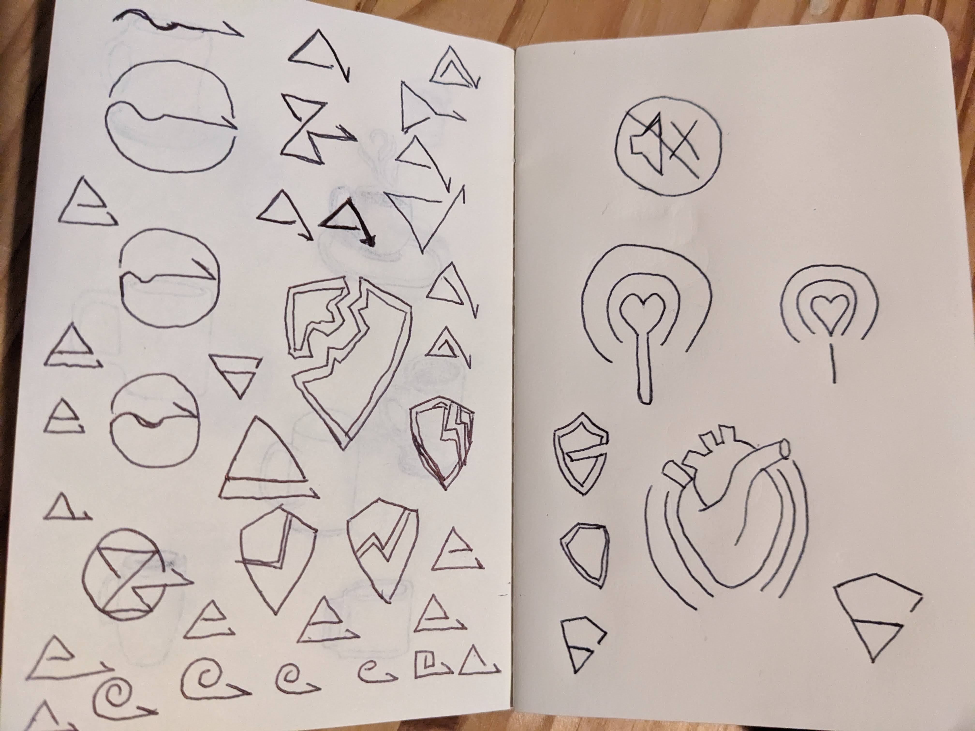 The first concept was the broadcasting of signals which I combined with a heart, which I think is pretty self-explanatory. I quickly moved off that idea as it was way too on-the-nose. I moved on to the idea of broken armor, but a shield worked way better for a simple drawing than any piece of armor. Everything I tried just looked like a low armor indicator in a video game though. So, I moved on to the idea of a line that starts out bouncing around and ends up straightening out. The concept being that I’m trying all these new creative things and being vulnerable, and eventually, I’ll hit my stride and find my groove. This slowly morphed into various shapes with an arrow coming out of them. I started doing the little snail looking ones and then, I tried making that into a triangle because that’s my favorite shape. I liked how that was looking. I was onto something. Then, I decided to flip it so the triangle was pointing down, and I realized that it looked like a shield! And with the half-arrow line thing, it had a gap on one side which made it look like an abstract broken shield!
Hidden Meanings
At that point, I decided to take it into Excalidraw, which is what I usually use when I am mapping stuff out digitally. I used it in my Album Posters Project as well. I made a few different versions and orientations to get a feel for how it could work.
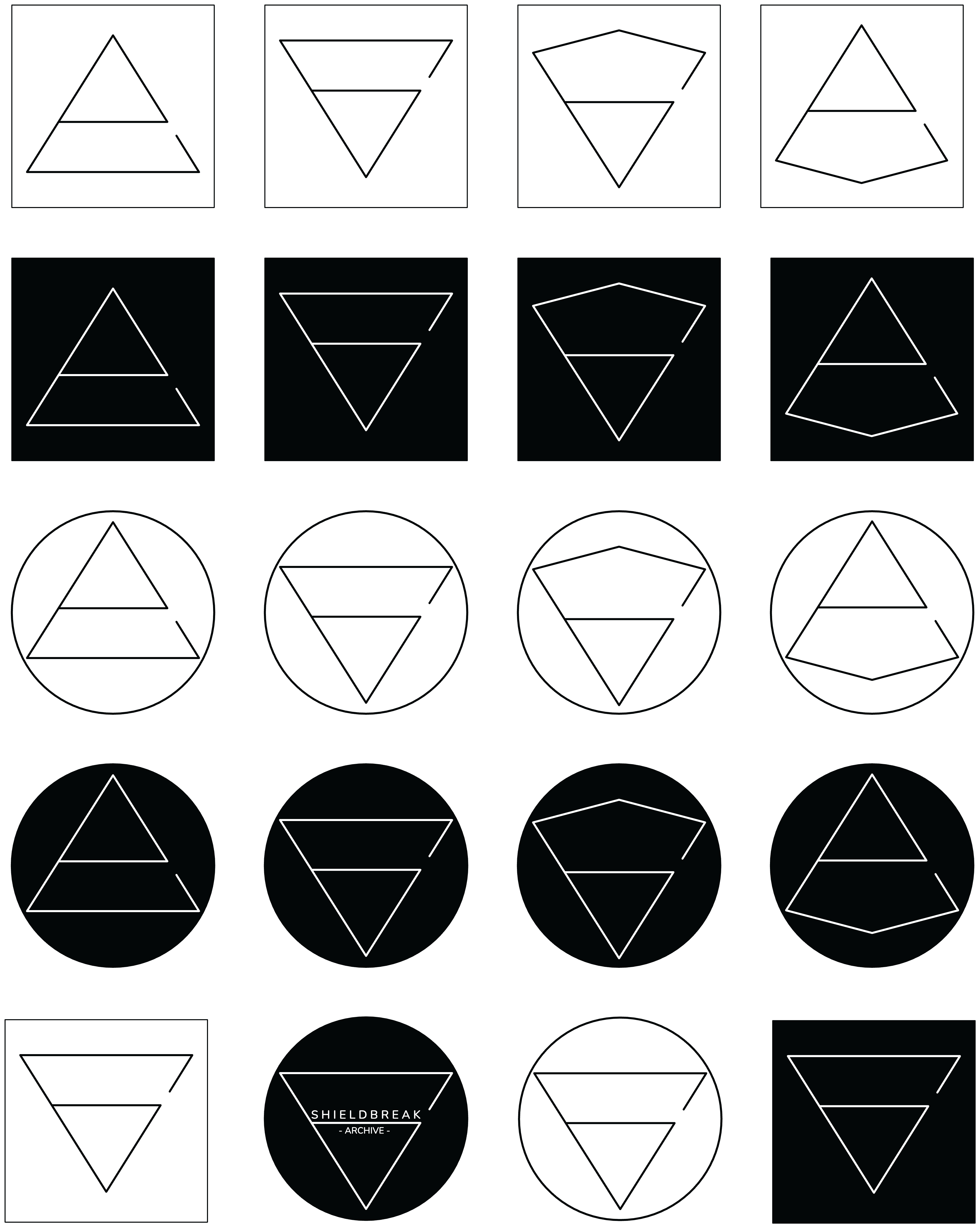 I examined each of them and pulled out all the hidden meaning I could find in each. First off, the whole thing is supposed to be a broken shield. Obviously, symbolizing vulnerability.
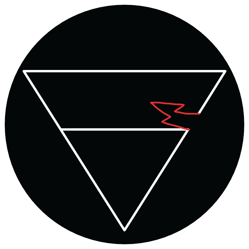 Then, the line on top is like a half-arrow kind of thing, and the idea there is that the arrow was bouncing around chaotically before straightening out. As I said before, this symbolizes the hope that, even if things are hard at first, they will get easier.
![]() Another part that ties back to the song is this subsection that looks like a white flag in the dark. That is why I stayed with white on black for the colors. It’s kind of upside down in this version, but I think it still works.
Another part that ties back to the song is this subsection that looks like a white flag in the dark. That is why I stayed with white on black for the colors. It’s kind of upside down in this version, but I think it still works. 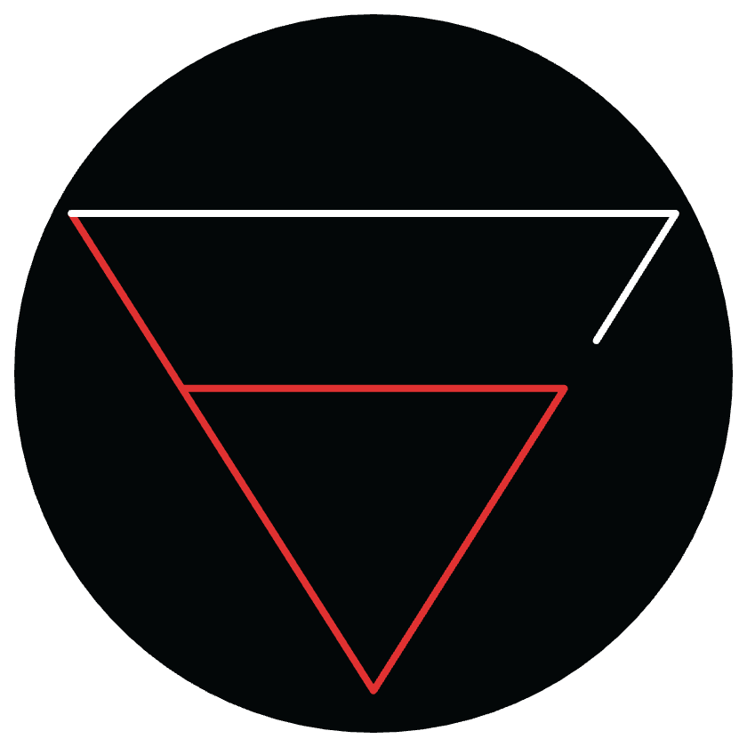 Also, I can see the smaller triangle part as liquid in a glass, which I’m choosing to interpret as a glass half full.
 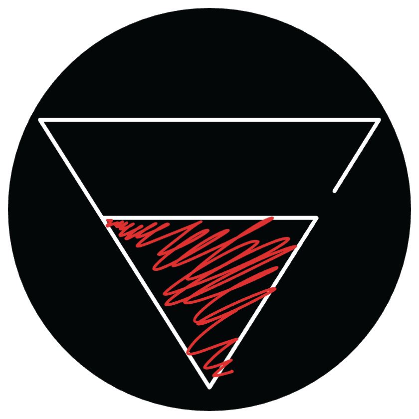 Lastly, with triangles, they can mean very different things depending on their orientation. Pointing up, they symbolize stability. Pointing down, they symbolize tension. Since I’m going out on a limb with this website, I’d say the tension aspect really fits.
What’s In A Name?
At this point, it was time to figure out what the name was going to be. I went through a bunch of terrible names before I gave in and asked AI. I took all the words I had thought of that I felt fit the vibe and told AI to help me make a name using them, but all of its suggestions were just as terrible as mine so I gave up on that. Eventually, I was just combining random words with “shield” and I got Shieldbreak, which immediately seemed so obvious and I couldn’t believe it took me so long to think of it. It felt like it was missing something though, so I went back through the AI suggestions and found add on words like “studio” and “labs” but Shield Break Studio is apparently the name of a video game developer and “labs” didn’t really fit, so I asked it for more of those kinds of words and “archive” was exactly what I was looking for.
Now that I had a name that I needed to work into the Combination Mark logo design, I had to abandon Excalidraw cause it has like 3 fonts. I have access to Figma for my job so I quickly learned how to use that and started making the shield logo. It took a while to get it all perfect, but once I did that, I could just copy it and try out a bunch of different placements for the words. Here are all the other variations I created.
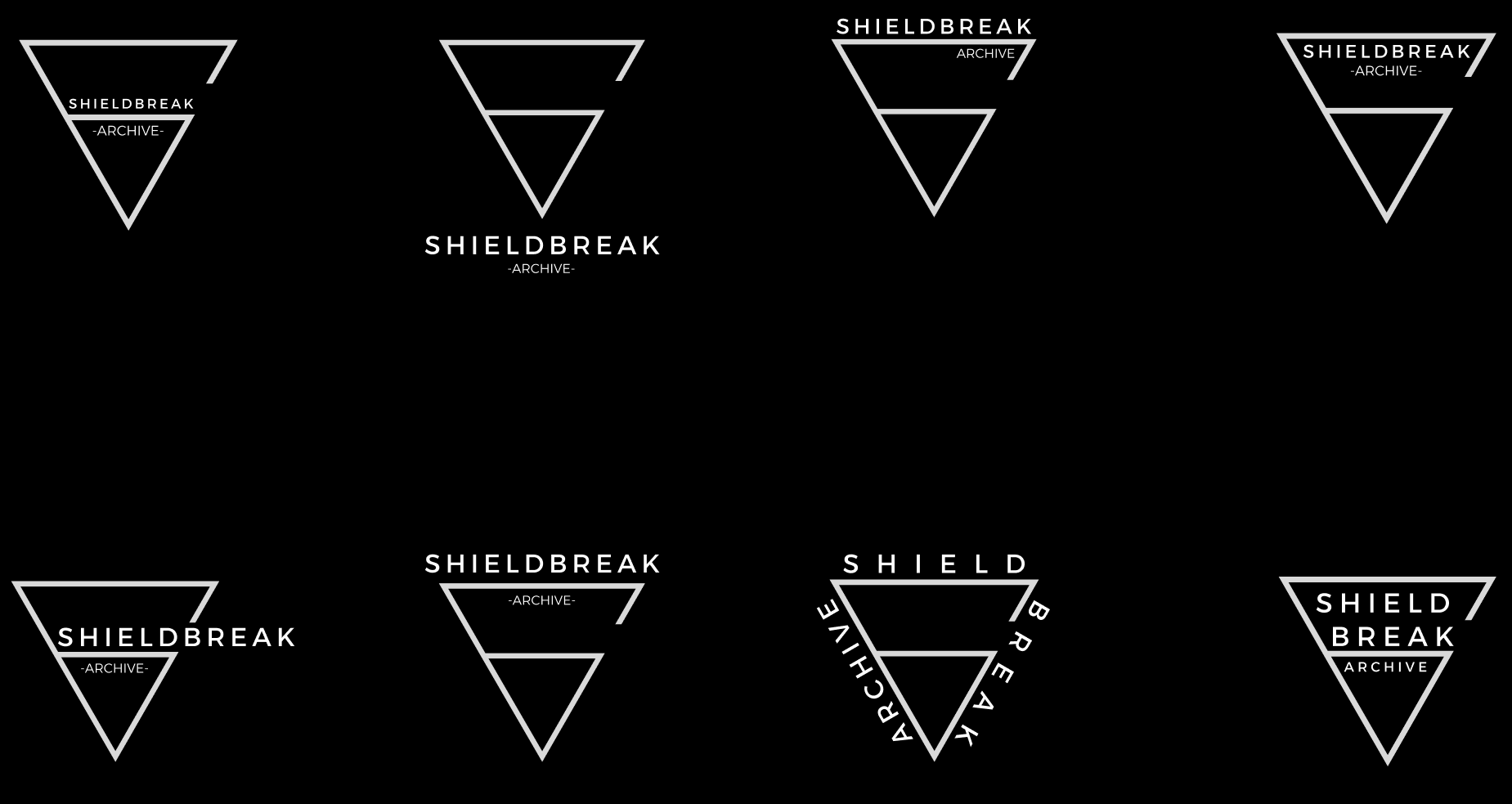 I picked the one I did because it was my favorite and everyone I’d asked liked it the best too. I think it’s cool that the name breaks through the crack in the shield. There’s also just an asymmetry to it that I like.
It’s All Coming Together
After I had the combo mark finalized, it was time to start implementing it! I used realfavicongenerator.net to generate the different favicons and tossed them into the assets folder for the website. I changed the profile and banner images for my Youtube and X profiles and I changed the account names so everything is now consistently branded. It took a lot of tweaking the css, but eventually (8 commits later) I was able to get the logo looking how I wanted it on the sidebar of the website. I had to remove the title and tagline cause it was too redundant and I had to get rid of all the container styling that was there by default for the Chirpy theme. Last but not least, I bought my first domain name! Based on a few Reddit threads, I decided to use Porkbun for the domain. It was super easy and cheap! Since I’m hosting this site via Github Pages, I just had to go into Porkbun and add some DNS records, add the domain into the Github Pages config, and update my site’s config.yaml file so it could generate the correct internal links, and voila! I now have a fancy, official looking website that I am super proud of!
Wrap it up
This was definitely one of my favorite projects so far, mostly because of how how satisfying it was to be able to take the thing I had just created and immediately implement it on the site. I also really like the graphic design work. I think I’ll probably start using Figma for more of these types of projects in the future now that I know the basics. It’s so much more powerful than Excalidraw. The hardest part was definitely coming up with the name. I spent a good few days on just that part and it took a while even after coming up with Shieldbreak Archive for me to fully accept it and buy the domain.
I’ve held off on actually showing anyone the site other than my wife because I wanted to wait until I had a few posts up and it was more polished. I think I’m ready to officially put myself out there and let people see what I’ve been working on. I’m actually really excited! So here goes!