Album Posters Project
Some context
I have been planning a home office remodel for a long time now. I’m not sure if I’ll ever get around to actually doing it, but it’s still fun to dream. I’ve been trying to work on it bit-by-bit, starting with some of the smaller things. I did some feng shui, got a new monitor, moved some knick knacks to storage so my desk was easier to clean, etc. But my most recent project has been creating some wall art.
I looked around on the internet and found a bunch of cool looking posters and prints, but nothing felt right. I needed something more personal. I considered posters of some of my favorite video games or movies, but they didn’t really match the aesthetic I was envisioning. Then one day, I was listening to The Shins and I remembered how much I like their album art and I realized that album art posters were exactly the type of thing I was looking for. When I searched online, I found these minimalist music albums posters that seemed to be all over Etsy and similar sites. There were all different variations but there were always one or two things that I would have tweaked if I were to make it.
So that is what I did! I found this iTunes Artwork Finder from Ben Dodson and started downloading all my top candidates for most influential albums. Some honorary mentions include albums from The Cat Empire, Nickel Creek, Copeland, Good Old War, Sleep Token, Vampire Weekend, Daft Punk, and Coheed and Cambria. Ultimately, I settled on three that are very special to me: 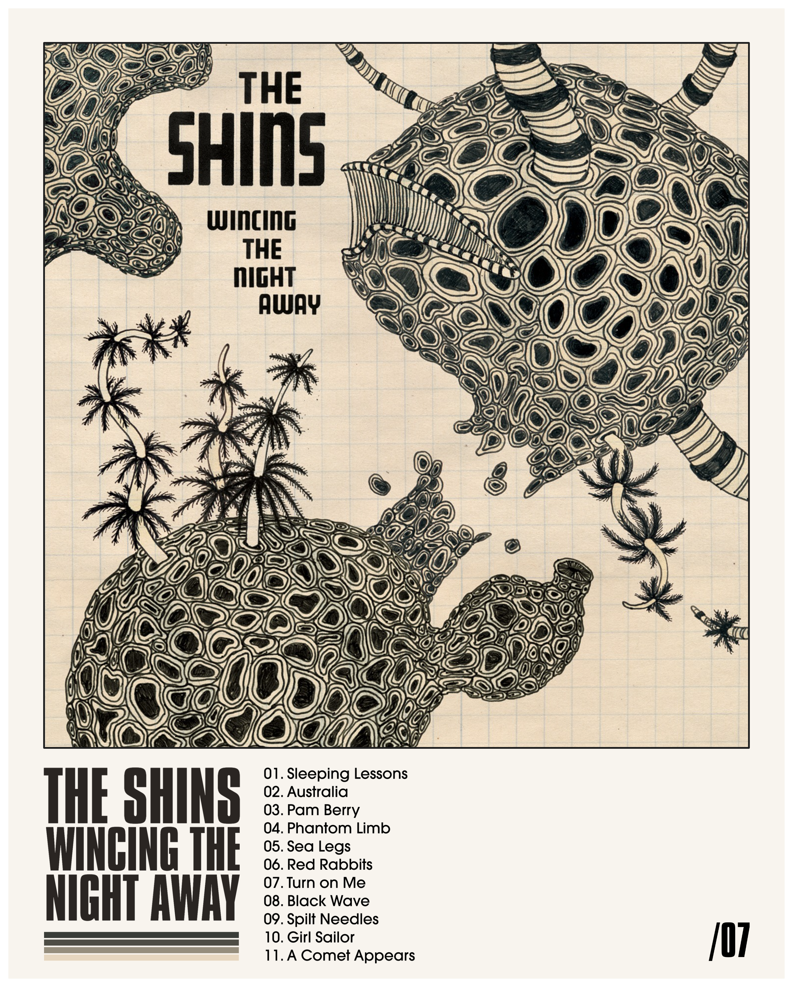
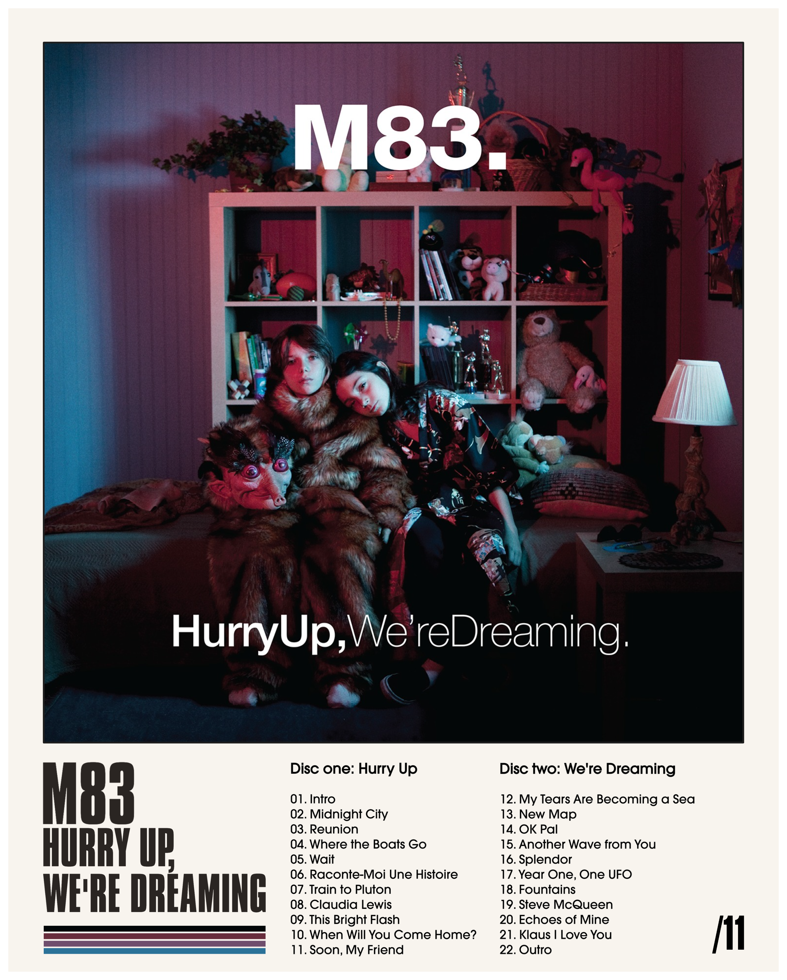
 All three of these are albums that I listened to on repeat during specific times of intense emotion in my life. For years after, listening to them would instantly transport me back to those times and places and would bring up the same emotions I was feeling a the time. I’ll admit that their Proustian effect has dulled as I have gotten older and listened through them more in other contexts, but they still hold up even without the memories and they will always hold a special place in my heart.
Design Process
Once I decided on those three, I went into Excalidraw and started mocking up some ideas for how I would arrange them. This took me months, working on it little by little as I found time. The biggest challenge was not having a way to use custom fonts, because Excalidraw only has a few basic options. What I ended up doing was fairly convoluted but it worked. First, I spent a long time looking for the right fonts. I wanted to match the fonts on the album art or at least get as close as I could. I eventually found Compacta, ITC Avant Garde Gothic, and Duvall. (and maybe one other that I might have forgotten) I downloaded those and imported them into a basic html file where I just typed out the text I needed, set a background color, to match the poster color, and viewed it locally in my browser. Then, I took screenshots of the text, dragged them into Excalidraw, and arranged them by cropping them in the right positions.
I used this image picker tool from Coolors to extract exact colors from the album artwork. I tried to get a representative mix of four colors that also worked well together in a gradient. Then I added the track lists and the release dates in the corners and that was that.
 As you can see from the rough drafts, It got progressively easier for each poster once I worked out the design and the process.
Outcome
I’ve only had one of them printed out so far as a test. It turned out to not be exactly 16x20 so I’m going to have to get creative in framing it. I got one of those cheap plastic poster frames with the sides that just pinch on and I am going to get some black backing paper to put behind the poster. Then it is just a matter of centering it in the frame and it will be ready to hang on the wall. Once I do the one, I’ll order the other two prints and do the same for them. I’ll update this article with a picture of the finished project once I’m done.
Overall, I’m happy with the way it’s turning out! I think they look really good and match the vibe I’m going for in my space. I’ve really enjoyed working on this project. There is something about designing something digitally and bringing it into the physical world that is exciting and.. inspirational, I guess. I’m now considering all the other things I could make this way, and these were just in 2D. Maybe I’ll have to try out some 3D printing one of these days.